Projects
This selection covers UX and product work across FinTech, EdTech, and kiosk interfaces, plus branding and content-driven projects. It shows my process from research, IA, and user testing to high-fidelity prototypes, motion assets, and working front-end builds.
Vasuqi
Final Exam · CleanTech Brand & Coded Website
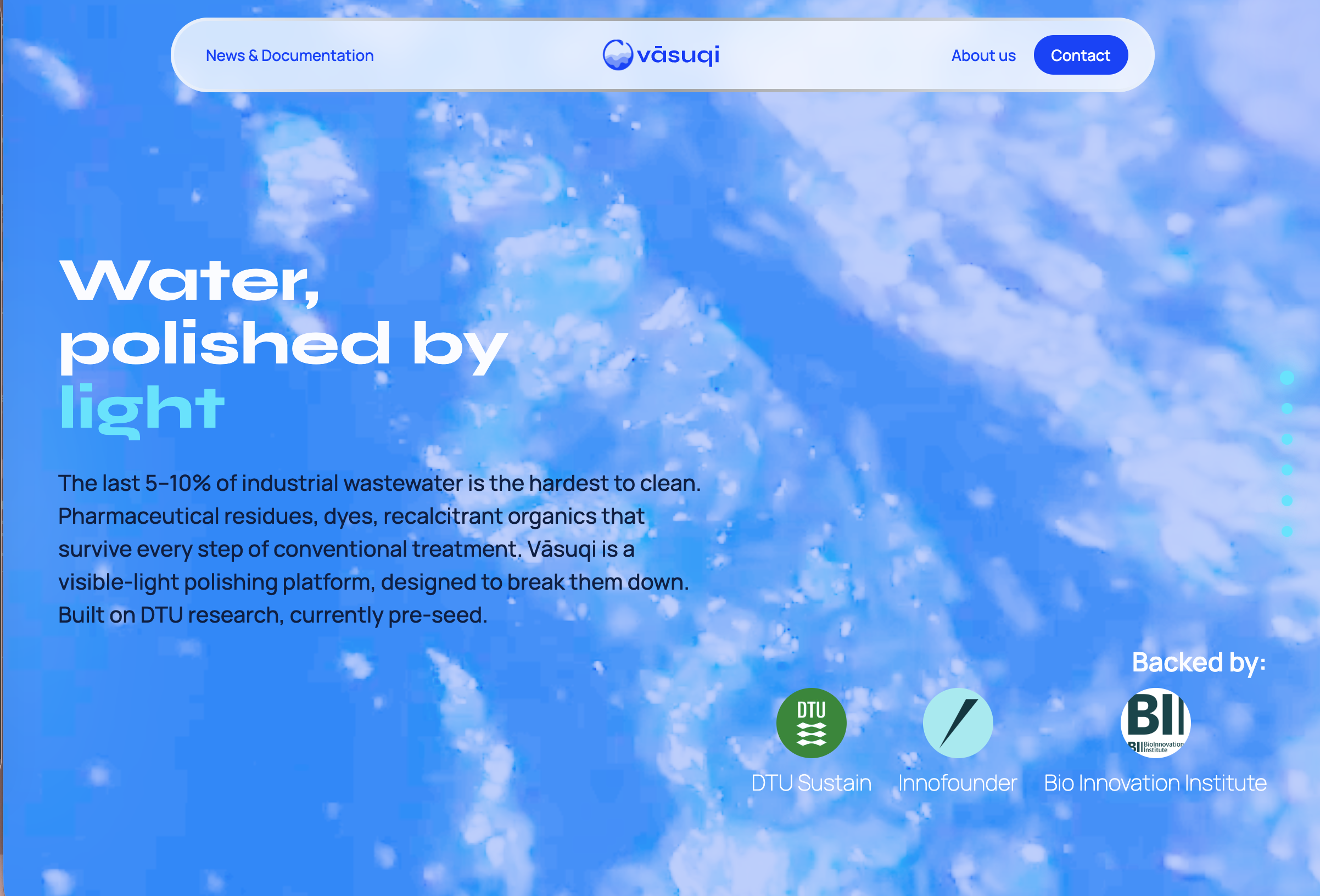
How do you build trust for a product that doesn't physically exist yet? Vasuqi is a DTU/BII-backed cleantech startup whose patented LED water purification technology is still pre-seed. Through the Double Diamond we replaced their dystopian cyberpunk identity with a light, transparent "Hard Tech Minimalist" brand, validated every major decision through expert interviews and user testing, and I built the coded website using Spec-Driven Development with AI agents.
View Case Study
The Challenge
Vasuqi's product, a fibre-optic reactor that uses blue LED light to destroy the last 5% of chemical pollutants in wastewater, only exists on paper. Without a physical prototype or pilot data, the visual brand alone had to function as the company's proof of concept: a trust architecture that convinces investors and industry decision-makers the team can execute. The existing cyberpunk aesthetic with neon gradients and dark mode signalled danger rather than the crystal-clear purity the technology delivers, and purple reads as a chemical hazard warning in the industry's safety standards.
Role & Process
Three-person team. We worked closely together across every phase of the Double Diamond. Beyond the shared work, I owned the information architecture, Golden Circle and USPs, colour palette development, logo A/B testing, tone of voice, and the coded website (Spec-Driven Development with BMAD).
Discover
- Desk research on EU directive 2024/3019 and Extended Producer Responsibility (EPR): from 2028, pharma and cosmetics must finance 80% of micropollutant treatment costs, making Vasuqi a compliance solution, not just hardware
- Expert interview with a Brand Director from Aquaporin (8 years in water tech) became the turning point: he challenged the cyberpunk direction and pushed us toward "light", "brightness", and "ultimate purity" as design drivers. The mythology should stay as a founder story, not the primary value proposition
- Field visit to a traditional water treatment plant, where we collected visual references later digitised into vector blueprints for the landing page
Define
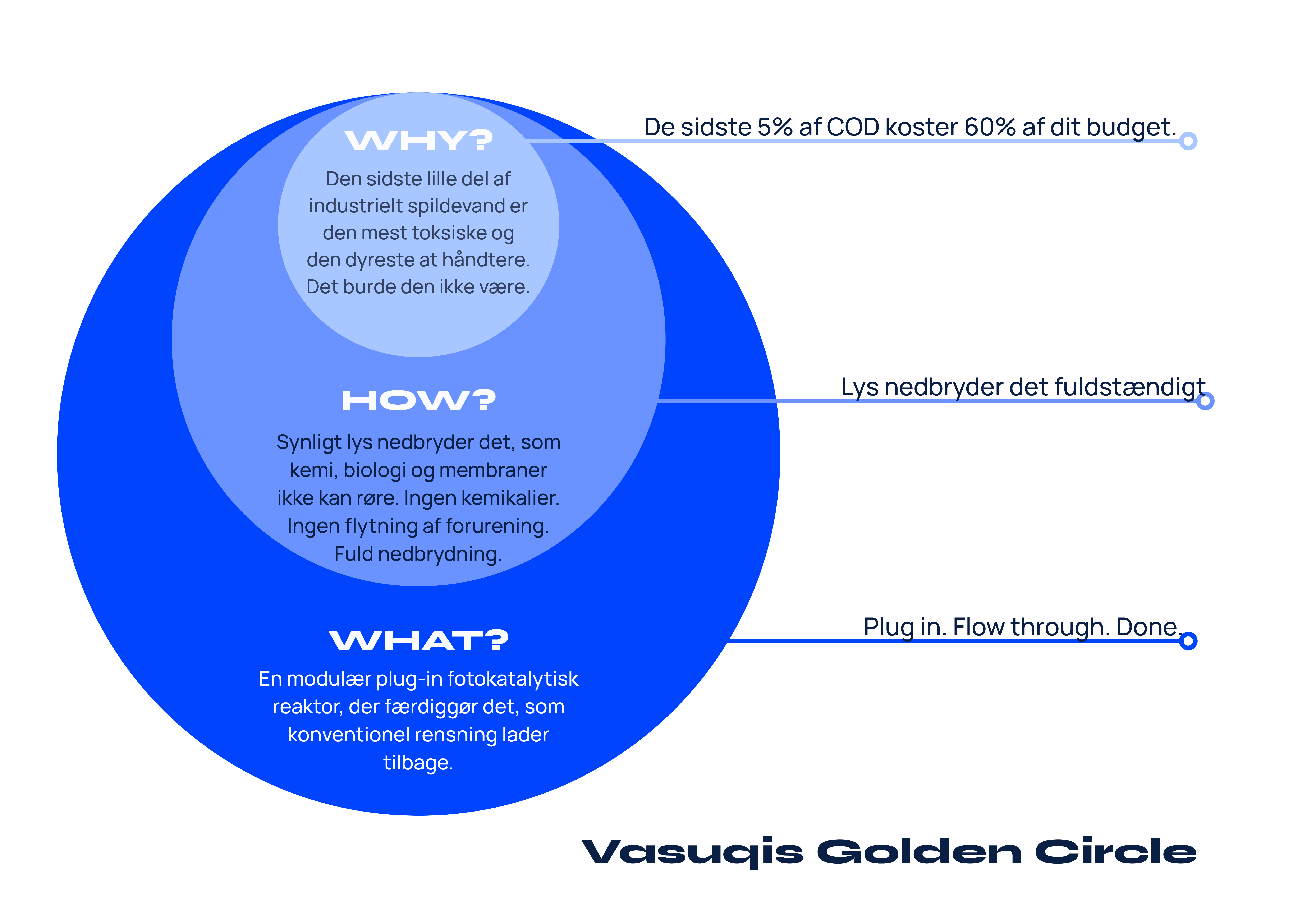
- Golden Circle defined the core narrative (why → how → what) and the USPs, split into functional (patented tech, chemical-free, decentralised) and emotional (relief, certainty, control), which directly steered every visual and copy decision
- Competitor benchmarking (Pharem Biotech, Arvia Technology, Watopi) showed that B2B trust in water tech is rarely built through soft green ESG branding, but through transparency, robustness, and a clinical visual language. That gap gave us the "Hard Tech Minimalist" positioning
- Target audience segmentation between the primary audience (climate-focused investors buying a vision) and the secondary audience (pharma/cosmetics compliance directors needing a regulatory solution), with personas and user journey maps for each
Develop
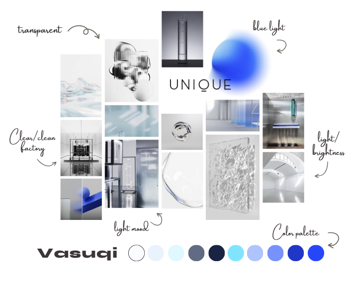
- Colour palette through two iterations: Mediterranean turquoise felt too "eco" and had no connection to the technology. We moved back to blue, anchored in the actual LED wavelength of the photocatalytic process, with a neon-cyan accent to break from the conservative industry default
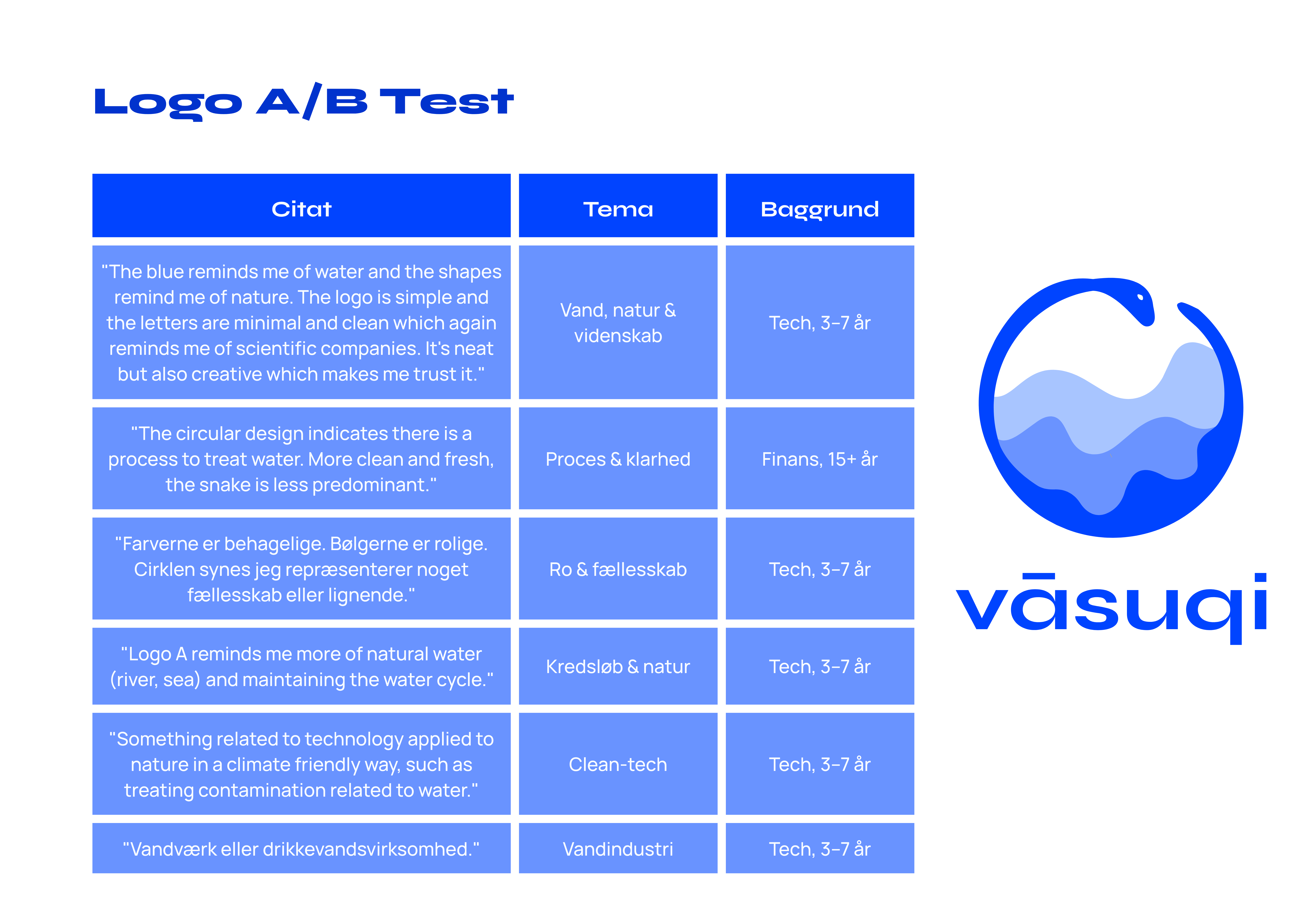
- Logo development explored the balance between the Vasuki serpent mythology and water tech credibility. A/B tested two refined directions with engineers, finance, and startup professionals. Logo A consistently triggered associations with water, science, and cycles; Logo B read as medical/warning. We went with A
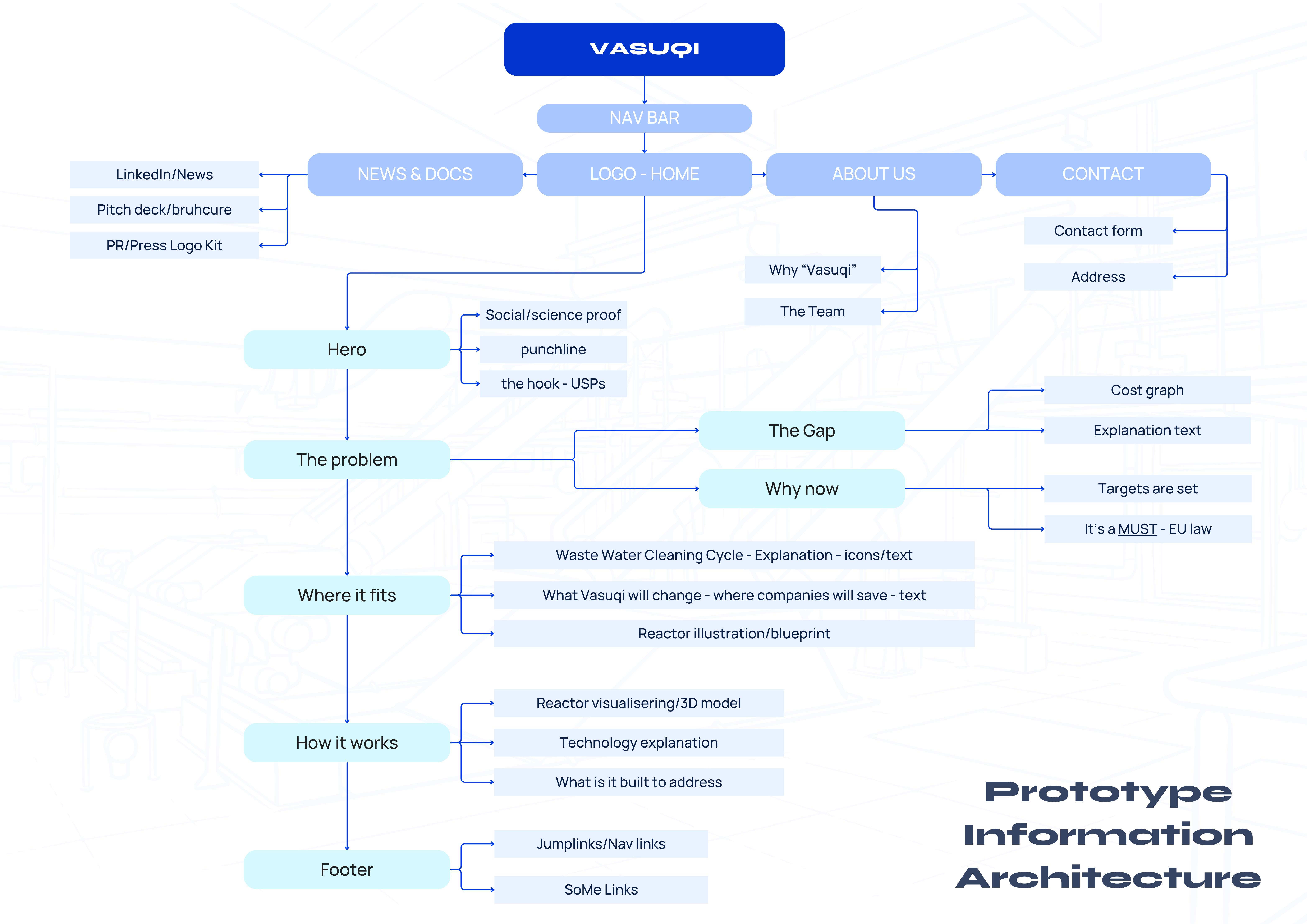
- Information architecture built from an open card sort combined with think-aloud testing, then validated through user journey maps and usage scenarios for both investor and compliance profiles. Led to a hybrid structure: scrollable landing page with three dedicated sub-pages, sticky nav, and social proof (BII/DTU logos) in the hero
Deliver
- Built the website using Spec-Driven Development via BMAD (Vite, Tailwind v4, GSAP, vanilla JS). Design tokens, colour palette, and typography rules were locked before any code was written. The key output was a design manual written for AI agents, so the non-developer founder can maintain and extend the codebase on-brand
- Gangster test with a librarian validated the page structure and navigation. Led to two concrete iterations: increased contrast on the hero overtitle, and moved the value proposition section higher in the scroll
Outcome
We delivered a complete brand system: visual identity, logo, colour palette, typography, landing page, pitch deck, business cards, brochure, roll-up, tone of voice guide, and a coded website with an AI-readable design manual. The project answered its own design problem: when the product doesn't exist yet, the brand has to be the proof of concept. Every decision, from the LED-anchored colour palette to the IA validated through card sorting, was built to carry that weight. The BMAD workflow gave me first-hand experience of how design intention travels through a dev pipeline, and the design manual means the founder can keep building on-brand after handoff.
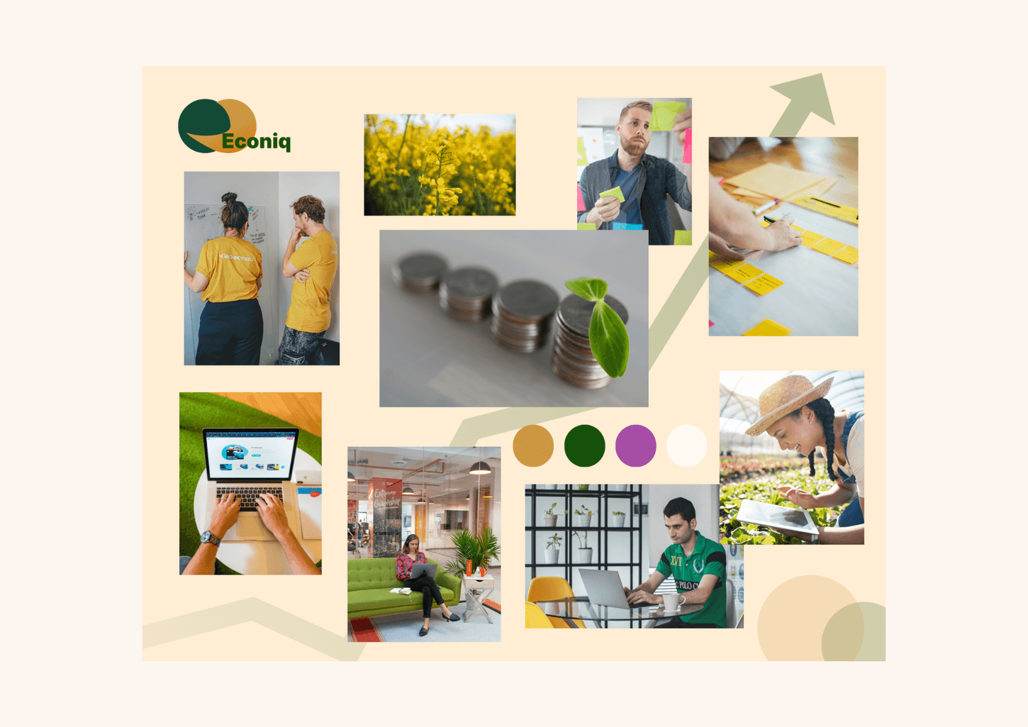
Econiq
FinTech SaaS Prototype
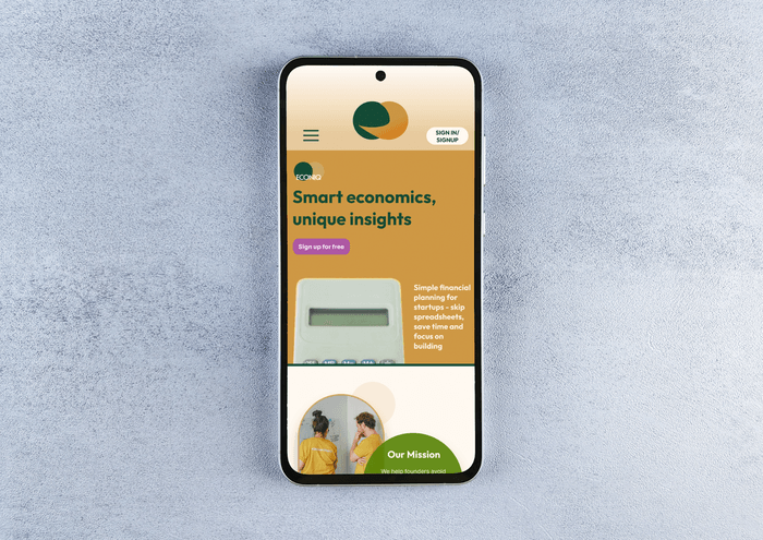
A FinTech founder had a solid concept, but his AI-generated prototype was hard to navigate. I led the UX redesign, rebuilt the information architecture, tightened the onboarding flow, and delivered a user-tested Figma prototype that non-experts could complete without help.
View Case Study
The Challenge
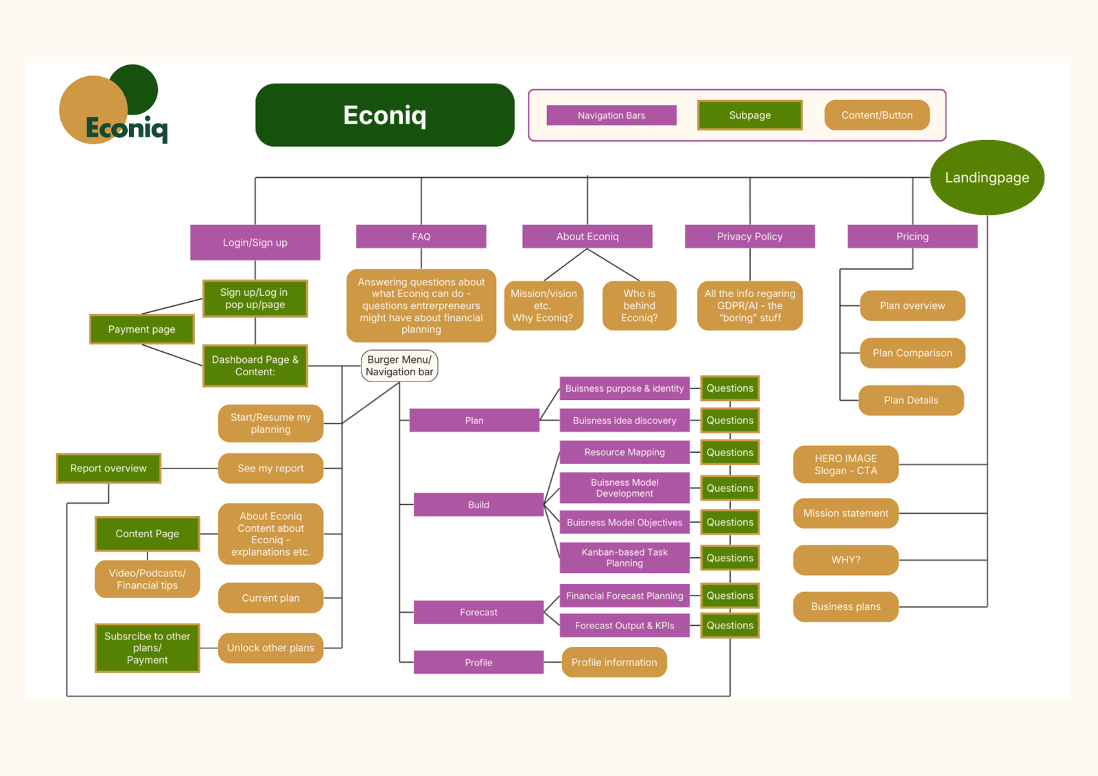
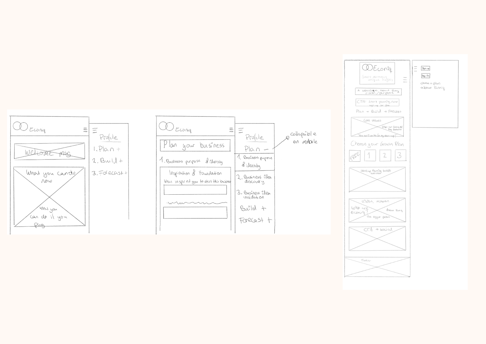
The concept was strong, but the prototype (built with AI tools) lacked structure: no navigation, inconsistent layouts, and an onboarding flow that made drop-off likely. The UX challenge was making forecasting and dashboard data approachable for small business owners without a finance background.
Role & Process
Two-person design team: I led UX, and a teammate led UI and brand identity.
- Audited the original prototype and documented usability and IA issues
- Rebuilt the information architecture and introduced a clear navigation model
- Redesigned onboarding to reduce steps and increase clarity at each decision point
- Built the redesigned flow in Figma
- Validated with 5 think-aloud usability tests + short interviews (local startup community)
- Ran expert reviews with a financial instructor to validate domain-specific assumptions
Outcome
We delivered a usable foundation for launch: brand, a coherent product structure, and a prototype. The founder accepted the redesign as the direction forward. In testing, users could complete the forecasting questionnaire and read the dashboard without assistance. That was a clear improvement over the original flow.
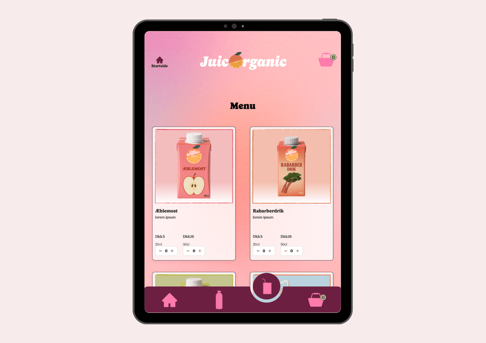
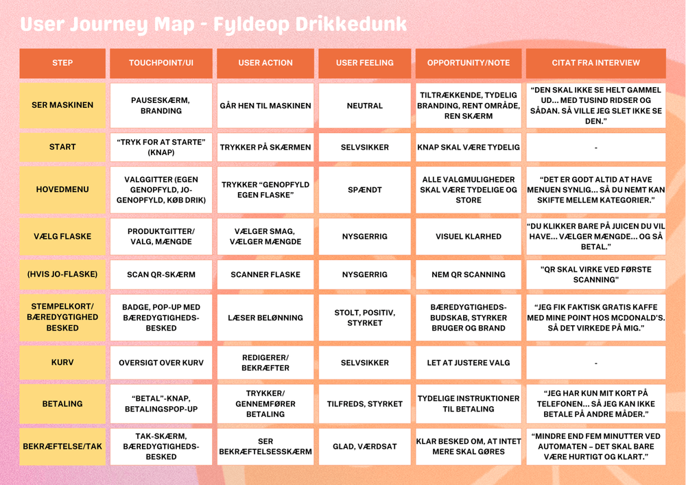
JuicOrganic
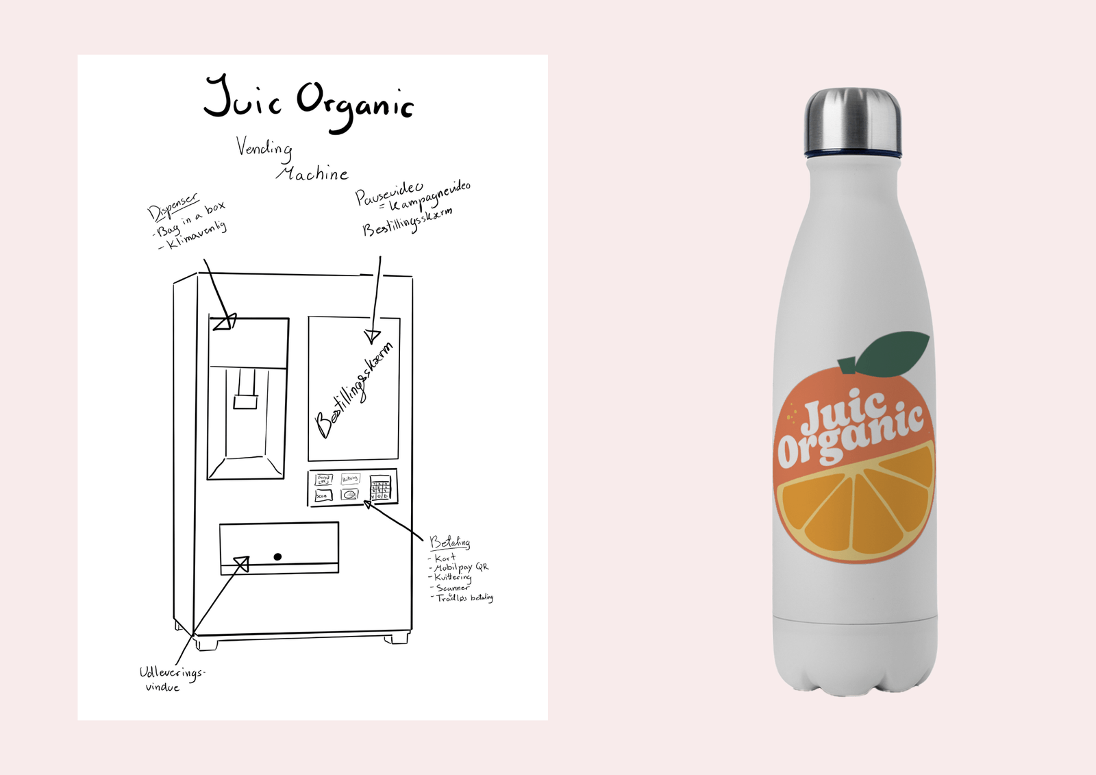
Smart Vending Machine Kiosk UI
How do you sell a product in a hurry, and still nudge more sustainable behaviour? For JuicOrganic’s shift from B2B to direct-to-consumer, we designed a smart vending machine concept with a reward loop for reusing bottles. I led UX research, shaped the kiosk flow, and built a working coded prototype.
View Case Study
The Challenge
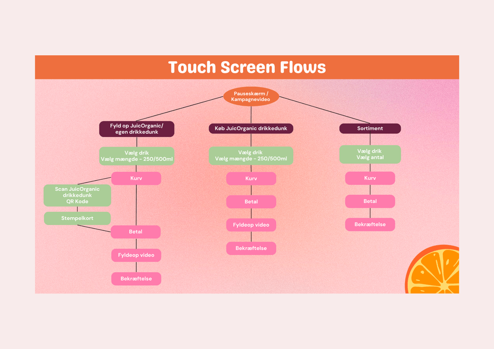
The brief was open-ended: bring a B2B juice brand to consumers. Once we chose the vending machine direction, the core UX problem was speed. The interface had to work in busy locations (transit hubs), where people abandon anything that feels slow or confusing.
Role & Process
- Conducted 2 in-depth interviews (anthropology-informed) on sustainability attitudes and reusable bottle adoption
- Synthesised findings into journey maps, scenarios, and feature priorities
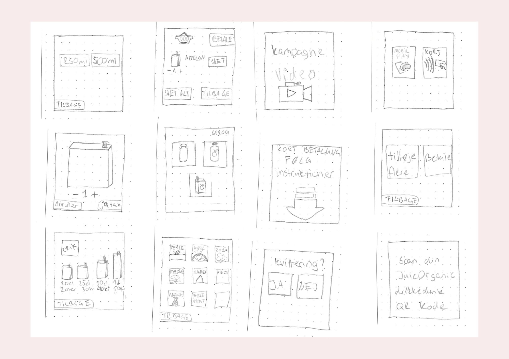
- Iterated wireframes to reduce friction and remove steps until the flow matched the real usage context
- Collaborated with teammates on high-fidelity visual design and illustrations in Figma
- Built a complete working front-end prototype (HTML, SCSS, JavaScript, Bootstrap), optimised for iPad Pro
- Produced an idle-screen promo animation in After Effects (also reusable for marketing)
Outcome
We delivered a working coded prototype, a high-fidelity Figma design, and a promotional video. It was a full concept with a testable flow, not just static screens. The project received top marks (12). Key learning: a “fast” kiosk experience comes from cutting steps and making decision points obvious, not adding more features.
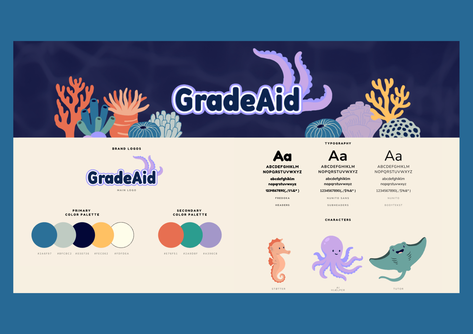
GradeAid
Neuro-Inclusive Gamified Learning Concept
DTU-backed EdTech concept for neurodivergent learners. Beyond the brief (visual identity + characters), we reworked the experience using neuro-inclusive research and Blue Mind theory, aiming for calmer interactions and a gamification system that fits how the target group handles motivation and failure.
View Case Study
The Challenge
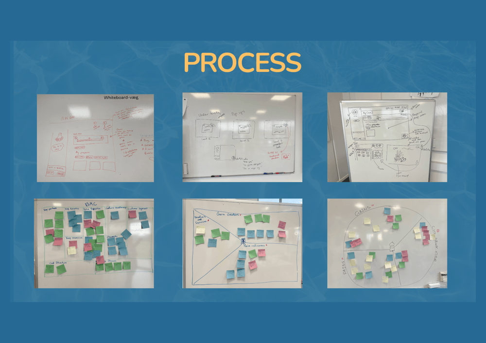
The client had working AI technology but needed a visual identity, a logo, and at least three animated characters (with tintable looks and accessories) to guide children through the app. When we researched the target group (neurodivergent children experiencing school refusal), we found that existing choices (colour palette, interaction patterns) could overstimulate the very users the product was meant to support. Most edtech assumes a motivated, neurotypical learner. We needed an experience grounded in how neurodivergent brains process visual information, motivation, and failure.
Role & Process
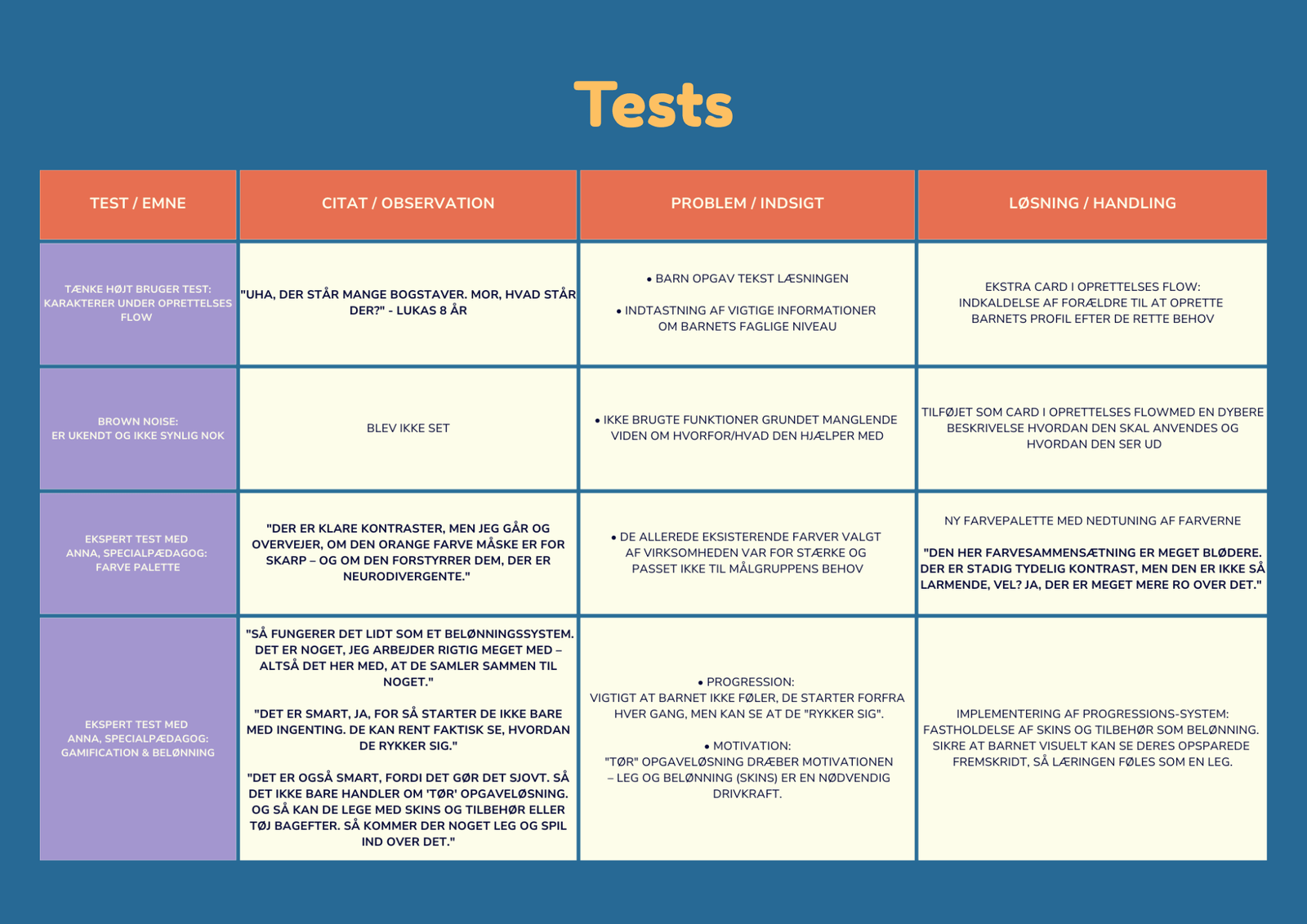
- Conducted desk research on neuro-inclusive design and Blue Mind theory
- Led an expert interview with a special needs teacher on colour palettes, motivation, and gamification design
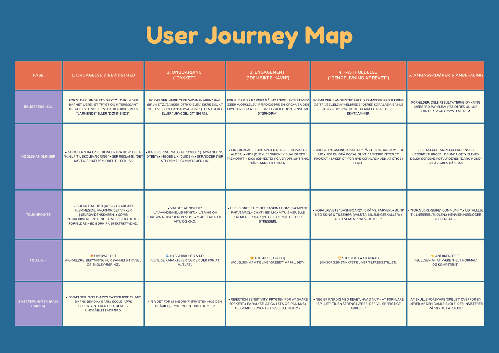
- Created a 5-phase user journey (discovery → advocacy) to map needs and risks across the experience
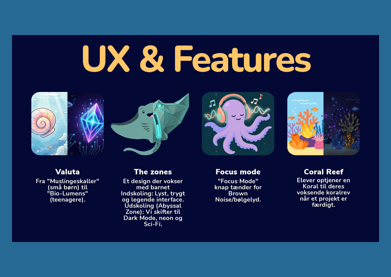
- Designed the gamification system (coral reef metaphor, XP/currency loop, reward shop, age-adaptive progression)
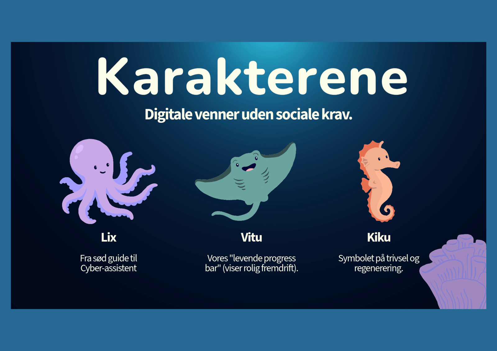
- Co-designed the character system (tintable skins + age-adaptive evolution) for long-term engagement
- Produced character motion in After Effects with slow, fluid pacing to reduce overstimulation risk
Outcome
The project received top marks (12). What began as a visual identity and character brief became a broader product reframe: calmer motion, research-backed colour decisions, and a structured gamification loop. We validated the direction through an expert interview (special needs teacher) and an early test session with one child to sanity-check engagement and tone.
GradeAid
Design Internship
Design internship in a DTU-backed EdTech startup. I owned the mascot design (Aidly), built UI prototypes for the learning path/PBL platform, and shipped motion assets that work on the web. I moved fast with incomplete briefs and frequent iteration.
View Case Study
The Challenge
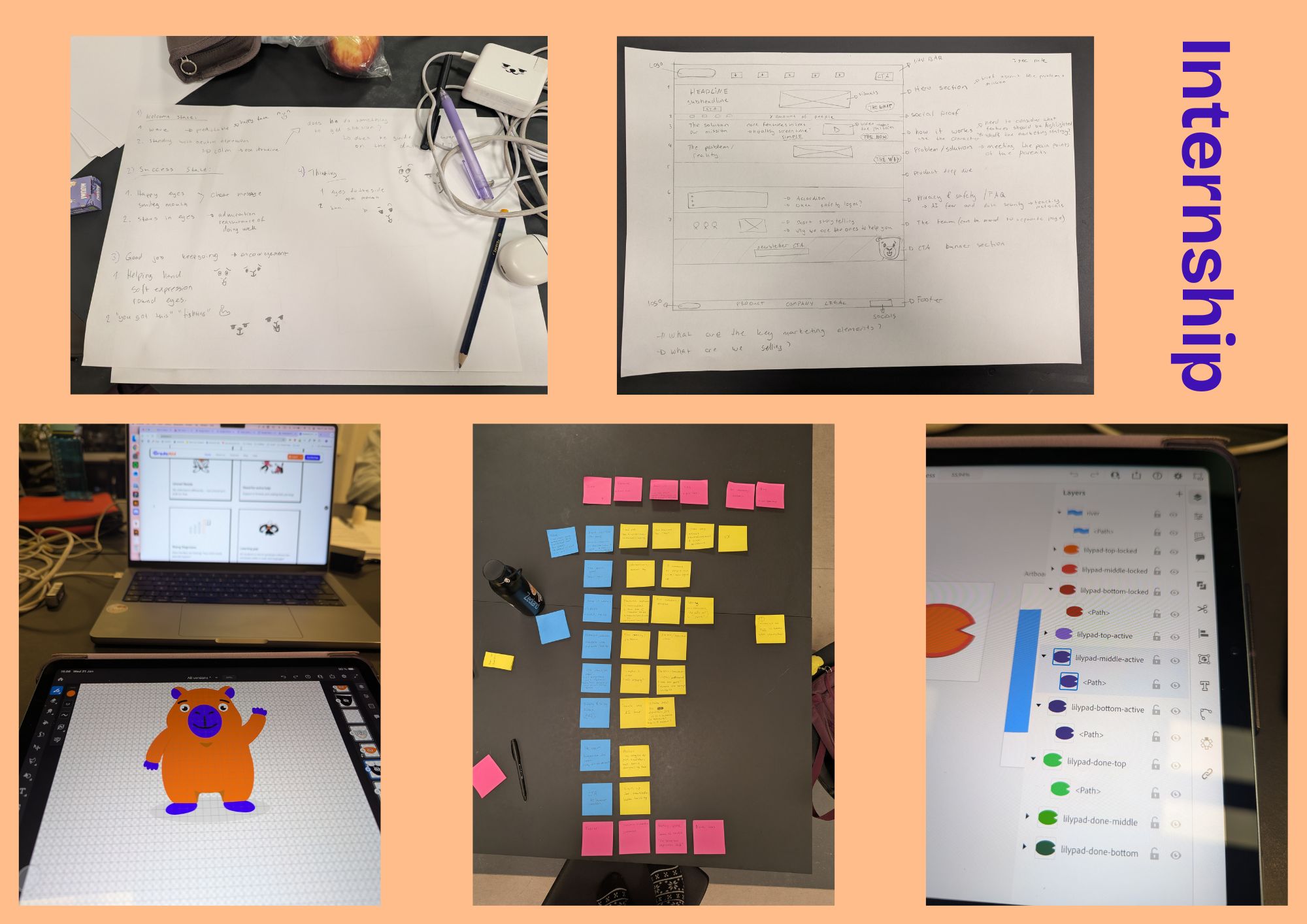
After our school collaboration, I joined GradeAid as a design intern. The company needed to take the concept from the exam project and make implementation choices that worked as a real product. My work included illustrating Aidly (the brand mascot), redesigning the learning path using visual storytelling, and creating motion content that performs on the web, while keeping the visual language gentle enough for kids.
Role & Process
- Designed and illustrated Aidly from scratch (Adobe Fresco + Illustrator) and created a reusable pose/expression library
- Prototyped the learning path and UI concepts in Figma and Google AI Studio
- Proposed ways to integrate the mascot into product and website UI
- Optimised SVG exports for lightweight, crisp graphics (smaller files, faster loads)
- Produced motion assets (After Effects, Fresco Motion, SVG) balancing quality with web performance constraints
- Supported usability testing focused on navigation and accessibility for the target student group
Outcome
I moved from student-team decision-making to individual ownership: Aidly (character system), the motion pipeline, and front-end experiments. The internship reinforced a core product skill: ship something testable with incomplete information, then iterate based on feedback and constraints.
Das Kleine Büro
Digital Agency Simulation
Six-week digital agency simulation with real client delivery. I led workflow across 9 people and 5 accounts, setting up roles, stand-ups, and communication so we could avoid bottlenecks and keep quality steady under pressure.
View Case Study
The Challenge
The scope was deliberately overwhelming. That was the point. Nine people with different skills, ambition levels, and working styles had to deliver to real clients at the same time. The challenge wasn’t just the design work. It was building a team structure that could function under pressure, with clear communication and accountability.
Role & Process
- Mapped team skills and work preferences to form effective sub-teams
- Assigned accounts based on strengths and project needs
- Introduced daily stand-ups for visibility and early bottleneck detection
- Set single points of contact per client to keep communication clear
- Supported delivery through people leadership: ownership, quality checks, and unblock work
- Owned one client case (Econiq) alongside coordination duties
Outcome
All client projects were delivered on deadline. When three agency teams had to choose one team to collaborate with, both local teams selected the international team, but the international team chose us, citing our inclusive team culture. Instructors highlighted our collaboration as a standout. My biggest takeaway: I went in calling myself "just a coordinator" and came out knowing that good teams need someone willing to lead, not just organise.
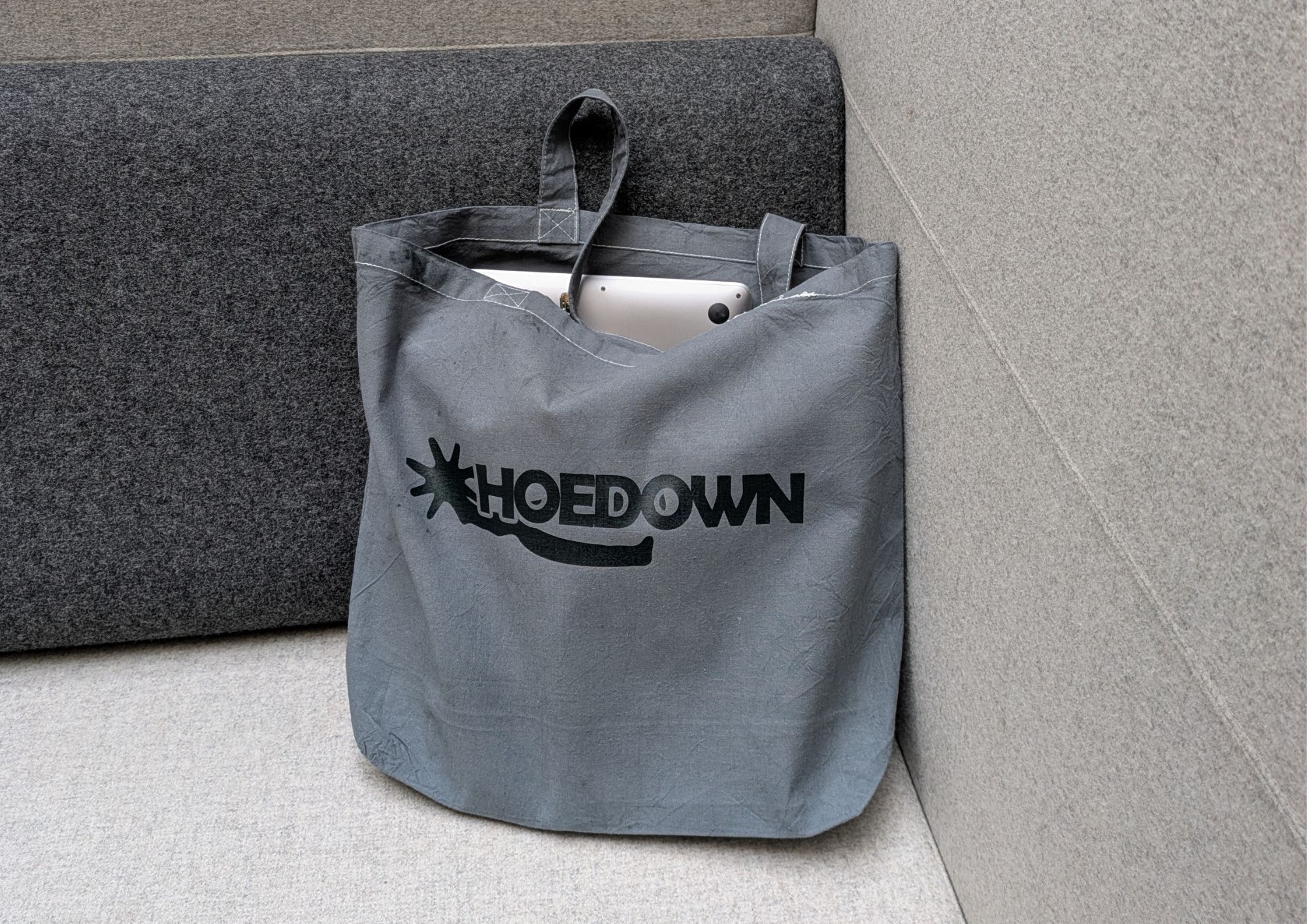
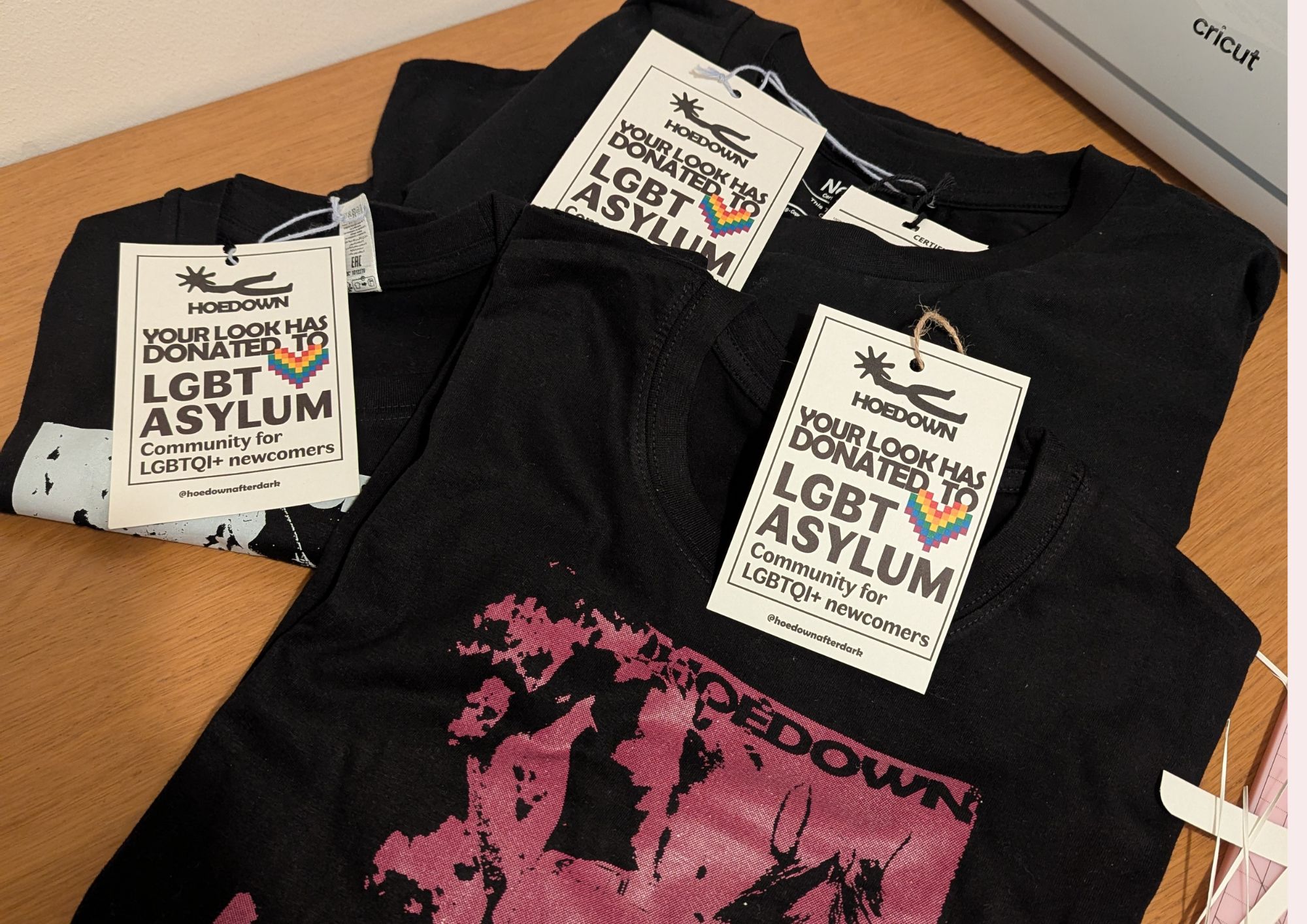
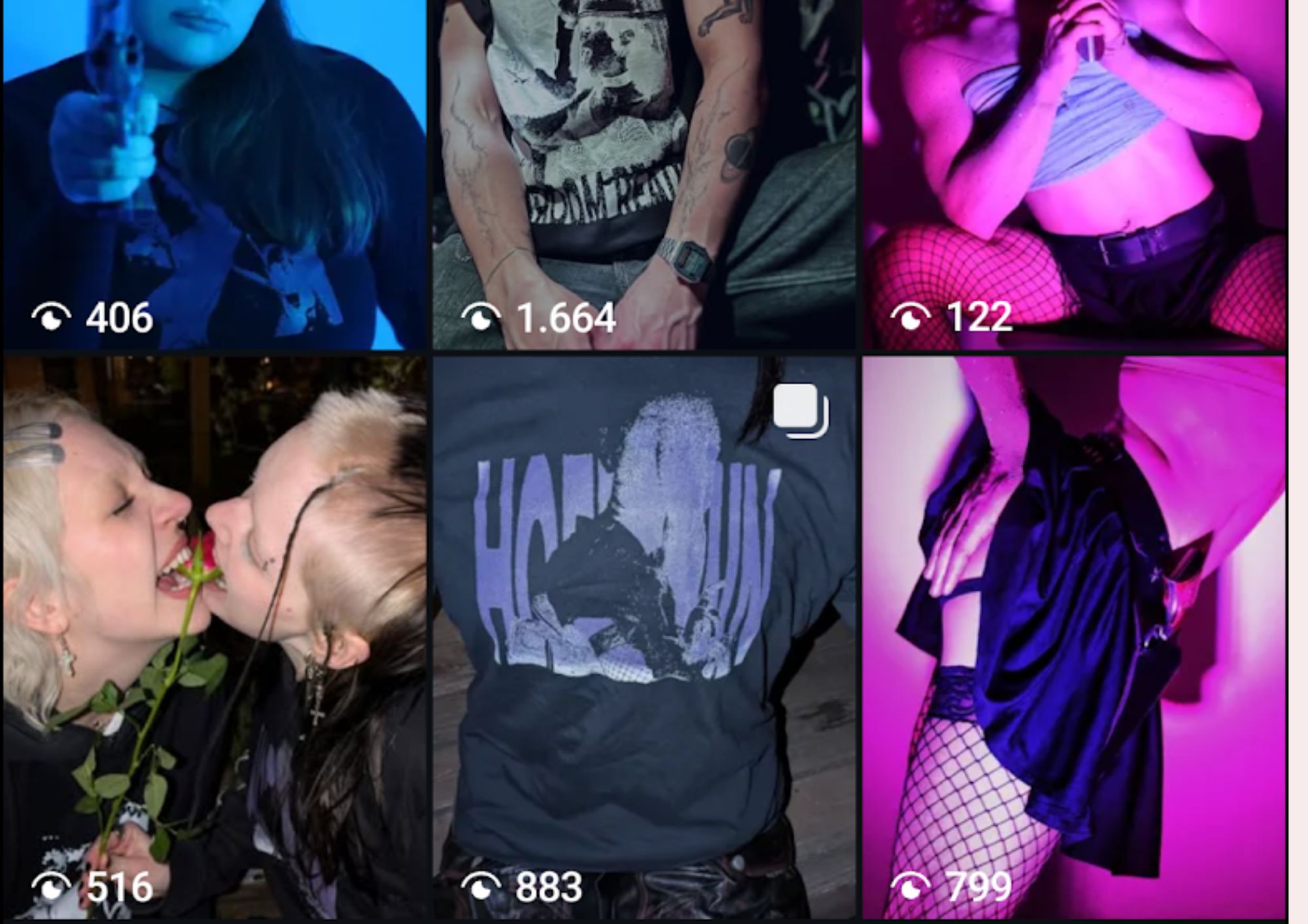
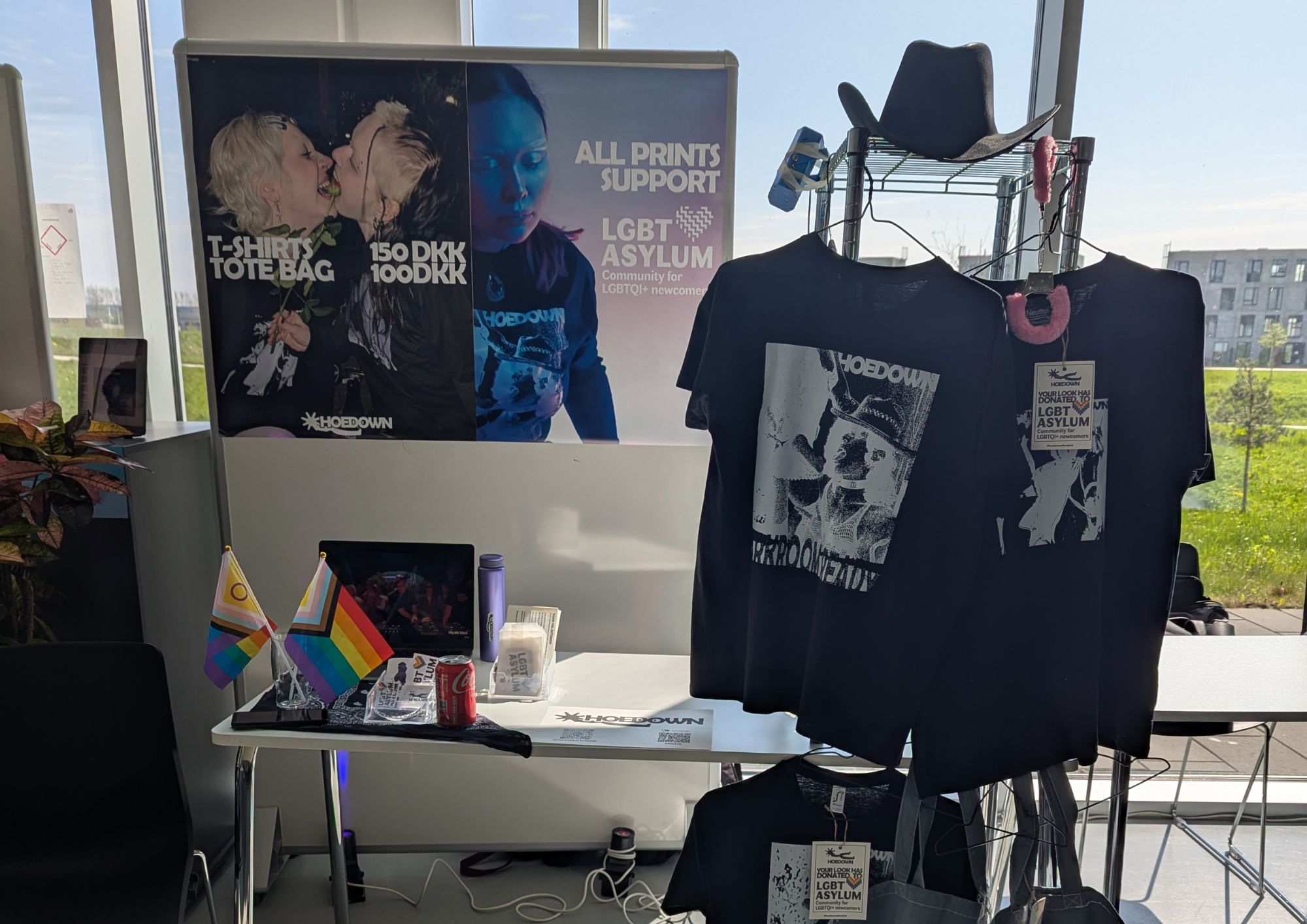
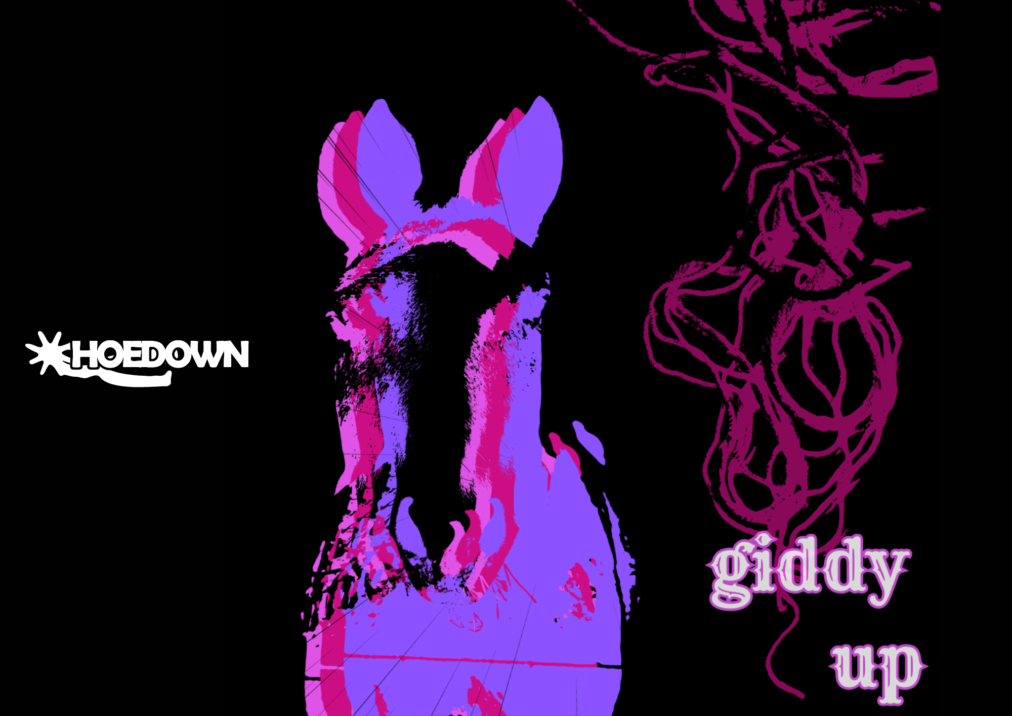
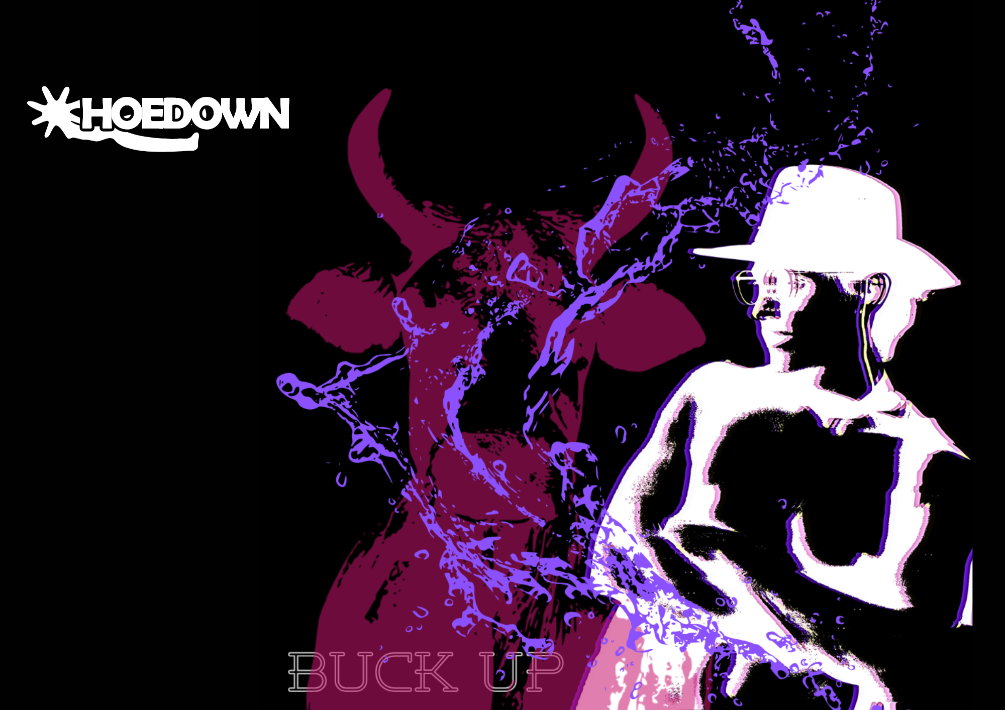
Hoedown After Dark
E-commerce Brand
E-commerce brand built end-to-end: concept, product line, webshop, and real sales. I led strategy and validation (Lean MVP testing + conversion-focused content), then iterated the concept based on direct audience feedback.
View Case Study
The Challenge
The brief was to create a working e-commerce brand from scratch: product design, a web shop, and actual sales. The real challenge was building something with a real identity, not just a student exercise. We leaned into the group’s shared connection to queer culture and the techno scene, which made the brand feel honest in a way a generic concept wouldn’t.
Role & Process
- Led strategy using Business Model Canvas, clarity SEO, and persuasive design principles
- Designed CTA hierarchy and donation framing to support conversion and trust
- Validated the concept with Lean methods: MVP tested at a flea market in a techno club with queer roots
- Iterated product line and messaging using direct target-audience feedback
Outcome
We launched a functioning web shop, sold real T-shirts, tote bags, and stickers, and donated all revenue (nearly 1,000 DKK) to LGBT Asylum. We were the only group to donate proceeds and the top-selling group at the project showcase. The brand also got real traction on Instagram, including a DJ posting a photo wearing our T-shirt, which drove a spike in engagement. This project stands out in my portfolio for being the most creatively different, and for proving that a specific subculture makes a stronger brand than trying to appeal to everyone.
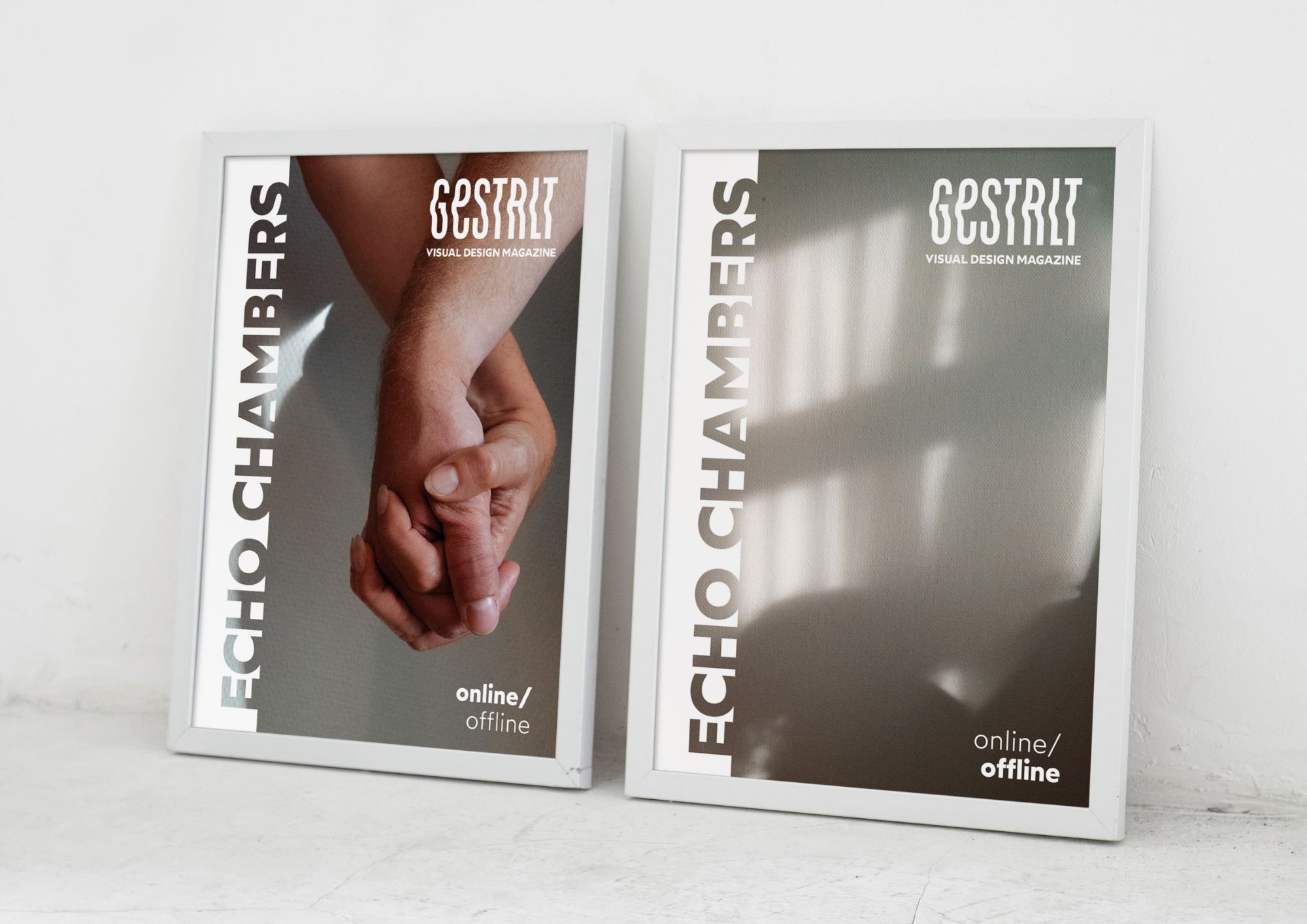

Gestalt
Digital Magazine
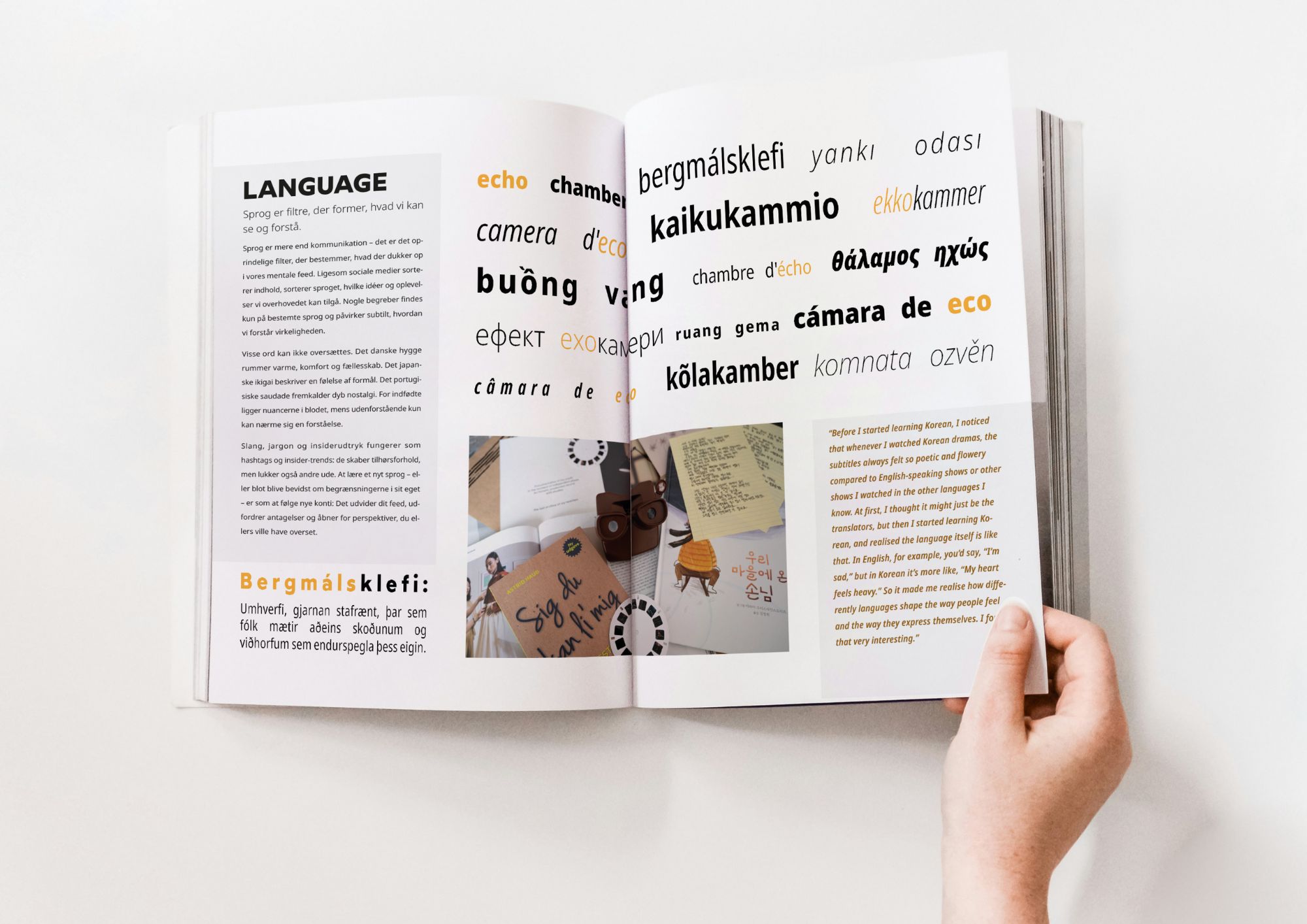
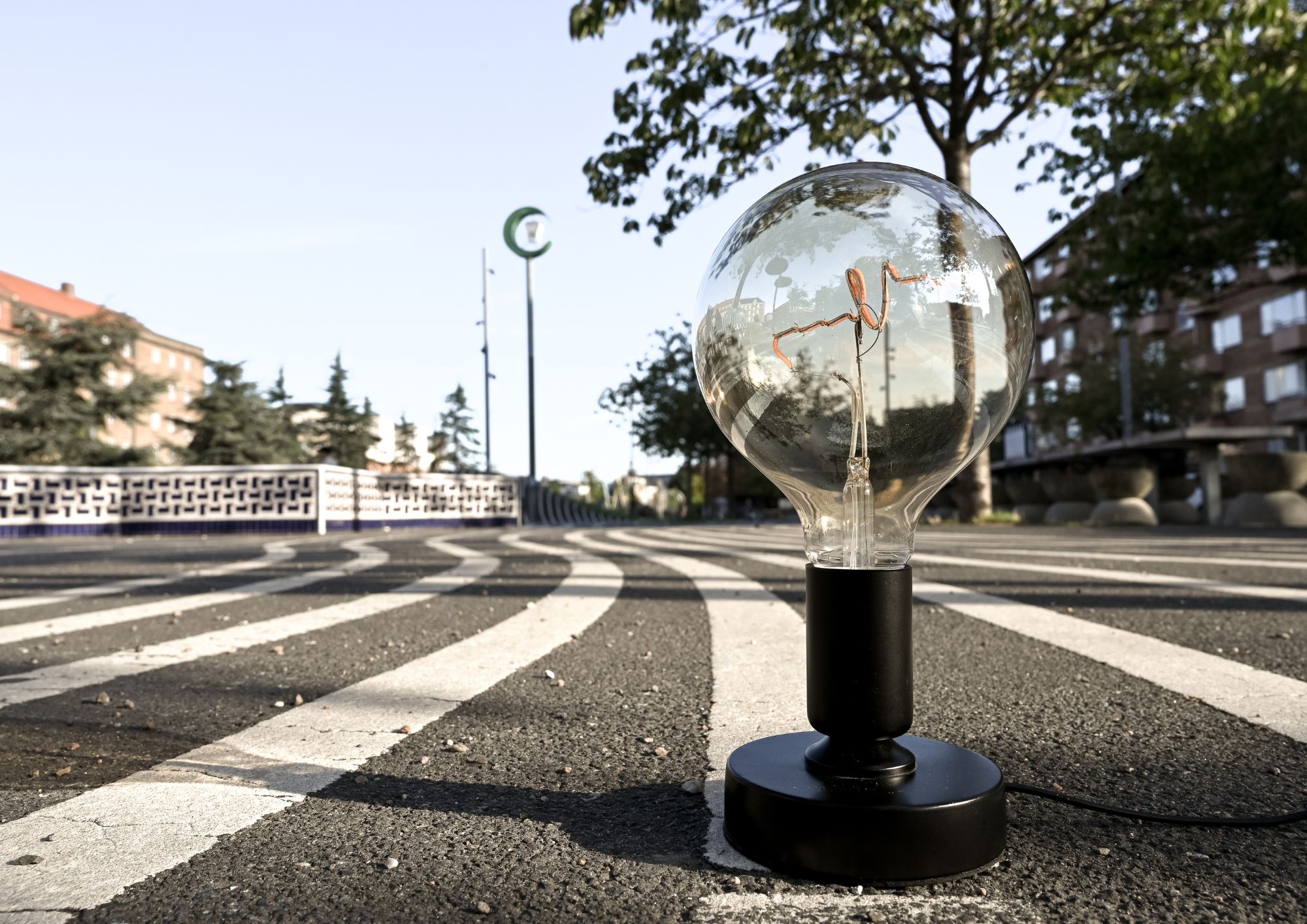
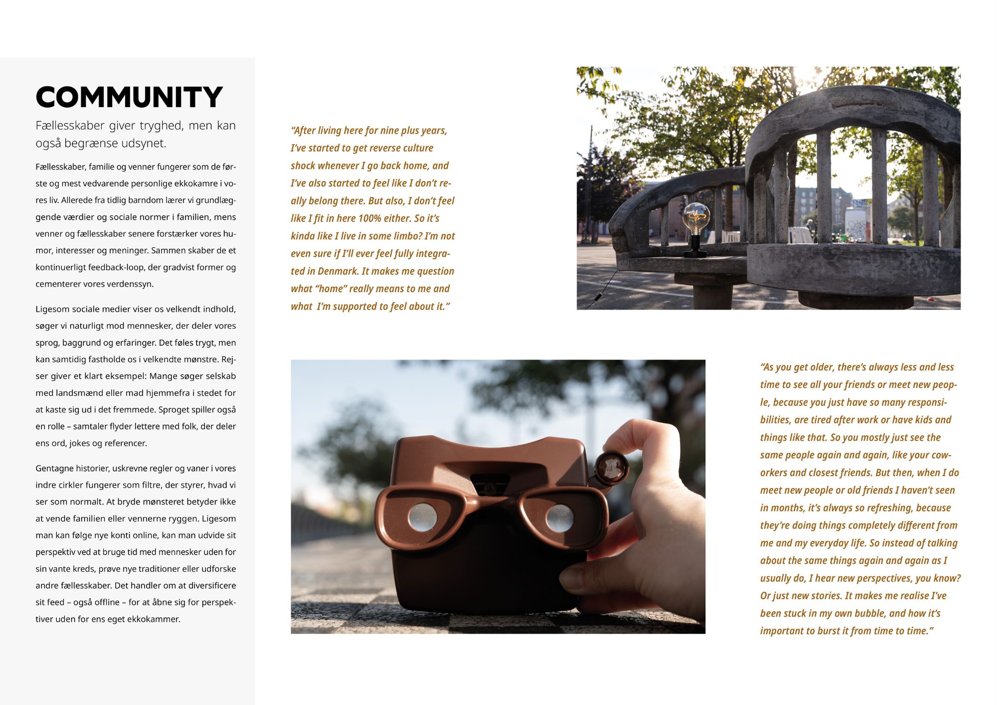
A feature article for a collaborative digital magazine. The angle is that echo chambers aren’t just online. They’re built into cultures, language, and communities. I wrote the article, shot all original photography, and designed the layout in InDesign using Gestalt principles and a strict grid.
View Case Study
The Challenge
Create a cohesive editorial piece end-to-end (concept, writing, original photography, and layout) and make a nuanced argument beyond the usual “social media is bad” framing.
Role & Process
- Framed the topic through an anthropology lens: culture/language/communities as “offline algorithms”
- Interviewed peers to avoid a single-perspective narrative and used quotes as structure
- Shot and edited original photography (Lightroom) to support the theme
- Designed the layout in InDesign using Gestalt principles and strict grids
Outcome
The article was published in the final collaborative magazine. One instructor said the layout looked like it could belong in a professional publication. The project shows visual thinking, grid-based design, and the ability to own a full creative process from idea to finished piece.
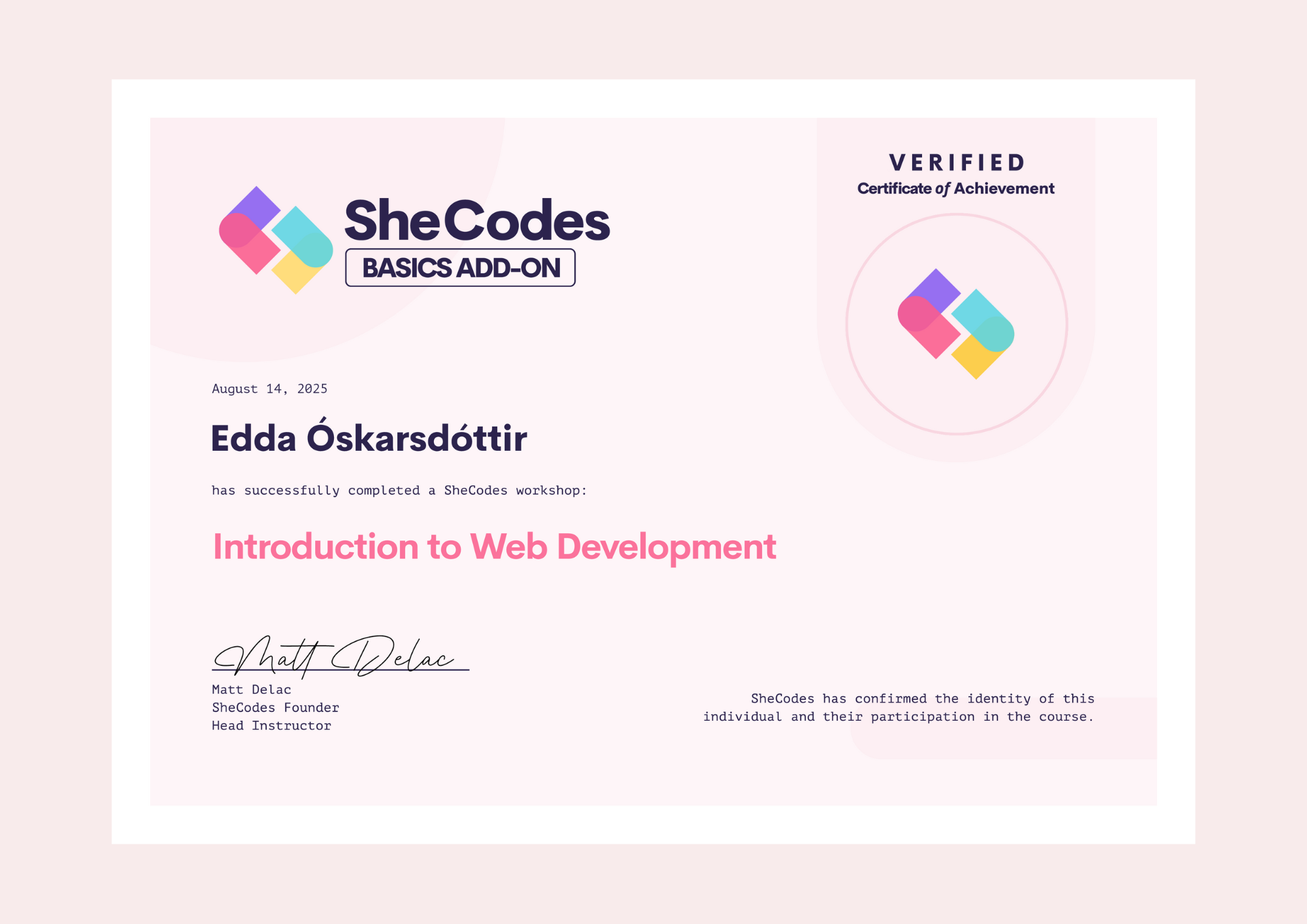
SheCodes
Front-End Development · Ongoing
I'm building my front-end skills through SheCodes, a coding program for women in tech. The curriculum covers HTML, CSS, and JavaScript with hands-on workshops. I'm currently completing the Plus track, which focuses on interactive applications and API integration.
What I've practised
- Responsive layouts with Flexbox and CSS Grid
- JavaScript DOM manipulation and event handling
- Building and deploying multi-page websites